Introduction
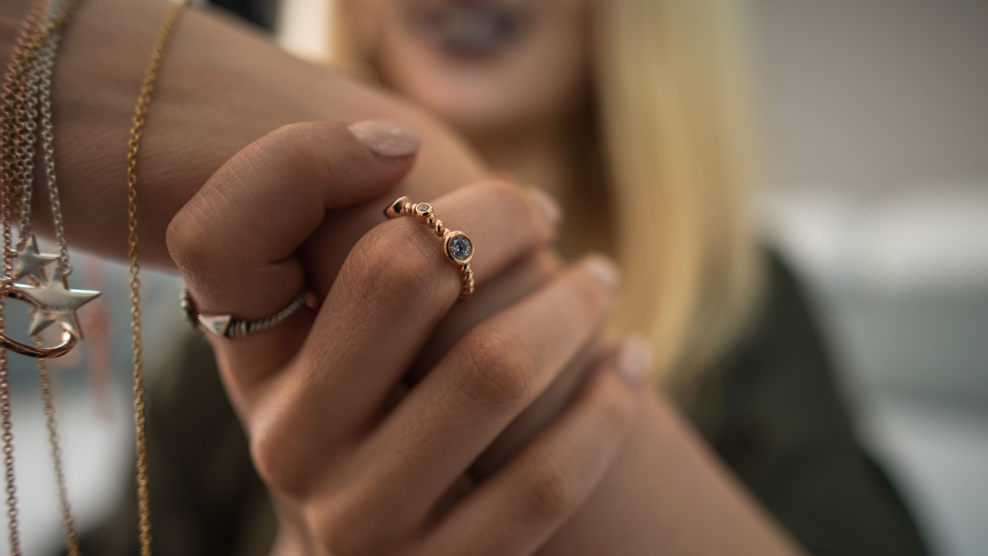
Welcome to the Carbon Jewellery Theme documentation. This guide helps your team configure storefront content, fine-tune styling, and understand every section shipped with the theme—mirroring the structure of the Eurus theme knowledge base while speaking directly to Carbon Jewellery’s brand story.
Theme Overview

The Carbon Jewellery theme powers luxury lab-grown diamond storefronts with an emphasis on immersive imagery, editorial storytelling, and collection-driven merchandising.
Key characteristics
- Soft pastel backgrounds balanced with rich accents for CTAs and typography.
- Image-led merchandising grids that spotlight category breadth and hero products.
- Story modules that communicate mission, ethics, and diamond education.
- Primary navigation tuned for quick access to Shop All, Contacts, Blog, FAQ, and About pages.
Home Page Sections
The default home template combines promotional storytelling with product discovery. Reorder or toggle any section in the Shopify theme editor to tailor the landing experience.
Announcement Bar
- Display a short promotional message across the top of every page.
- Supports text, emojis, and links; toggle visibility under
Header > Announcement bar. - Sync colour scheme with campaign palettes from Theme settings.
Header

- Hosts the brand logo, primary navigation, and utility icons (search, account, cart).
- Navigation items draw from Shopify’s
Online Store > Navigationmenus. - Fine-tune spacing, logo sizing, and icon toggles directly in the Header section.
Slideshow
- Large hero carousel with configurable imagery, copy, CTA labels, and links.
- Supports height presets, alignment, and gentle animation for brand storytelling.
Collection List
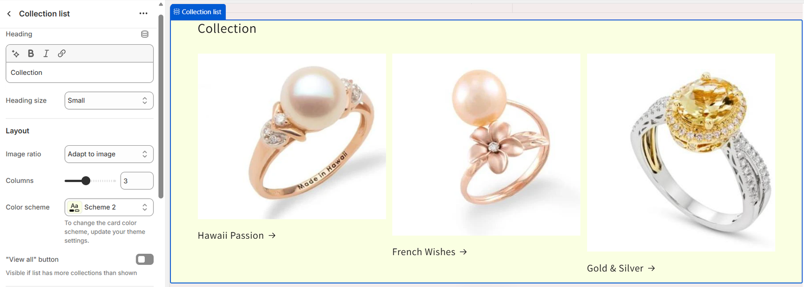
- Surface featured collections in a three-column desktop grid (1–2 columns on mobile).
- Each card supports imagery, collection assignment, and custom label text.
- Enable the optional “View all” CTA when more collections exist than displayed.
Multicolumn – Guarantees

- Highlight service pillars such as Free Delivery, Money Back Guarantee, 24/7 Support, and High Quality.
- Upload icons or imagery per column; optionally add supporting text or buttons.
Image with Text
- Split layout for narrative storytelling around sustainability and craftsmanship.
- Control image placement, content alignment, and animation style.
Announcement Strip
- An optional mid-page callout for seasonal campaigns or limited-time offers.
- Pair an icon with headline and supporting copy; match colour scheme to your palette.
Product Collection Categories
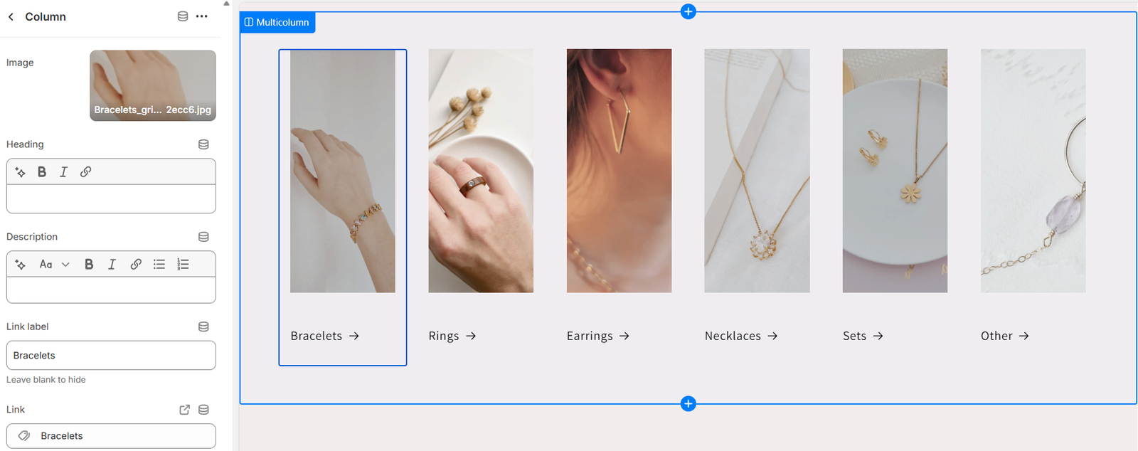
- Showcase key categories (Bracelets, Rings, Earrings, Necklaces, Sets, Other) with visuals.
- Configure image ratio, width, button labels, and links for each column.
Shape of Gemstone
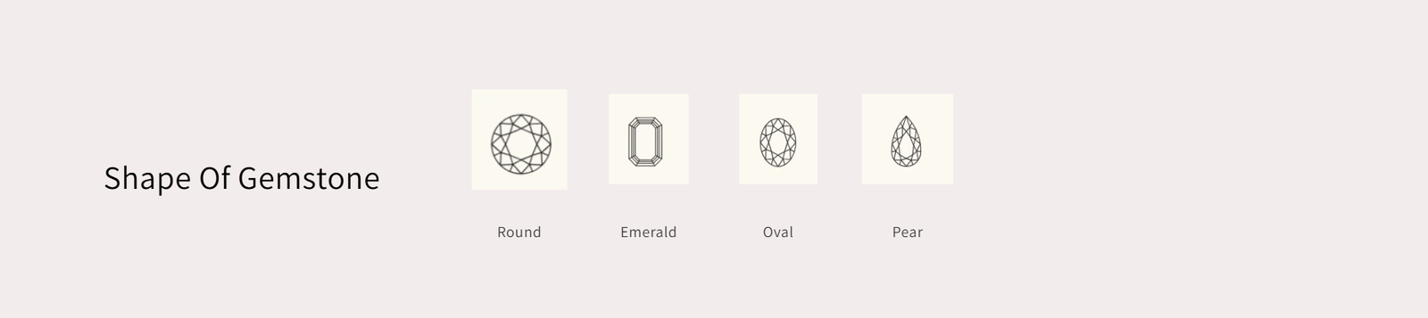
- Custom section highlighting gemstone cuts such as Round, Emerald, Oval, and Pear.
- Upload line-art icons and link each tile to the relevant collection.
- Adjust icon size with the built-in slider to match your design language.
Image Banner
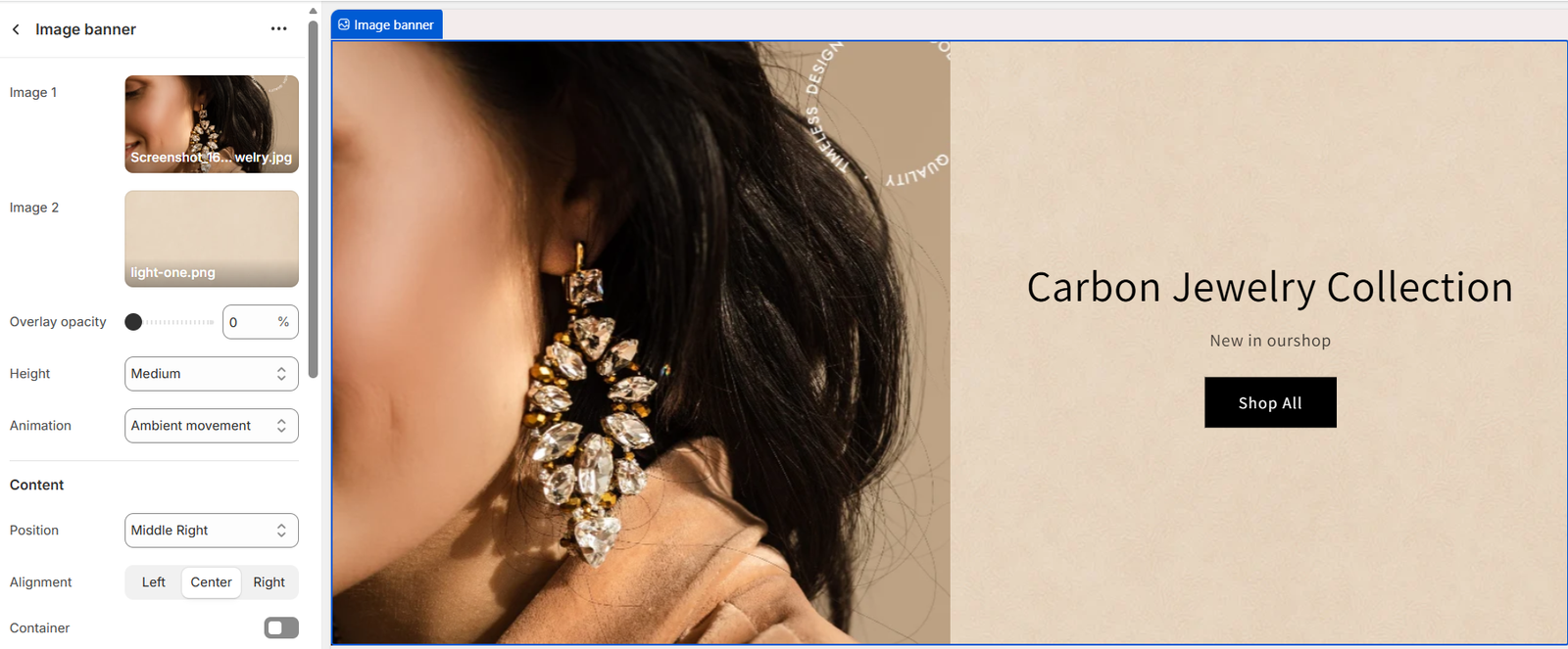
- Full-width banner combining lifestyle imagery with a CTA (e.g., “Shop All”).
- Supports layered imagery for texture plus adjustable overlay opacity.
Blog Posts
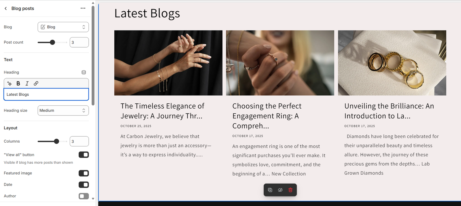
- Display the latest three stories from the Blog resource.
- Toggle featured image, date, author, and the “View all” button per layout needs.
Footer
- Dark theme footer with brand statement, navigational quick links, and contact details.
- Enable newsletter signup, social icons, and locale selectors as required.
Shop Page
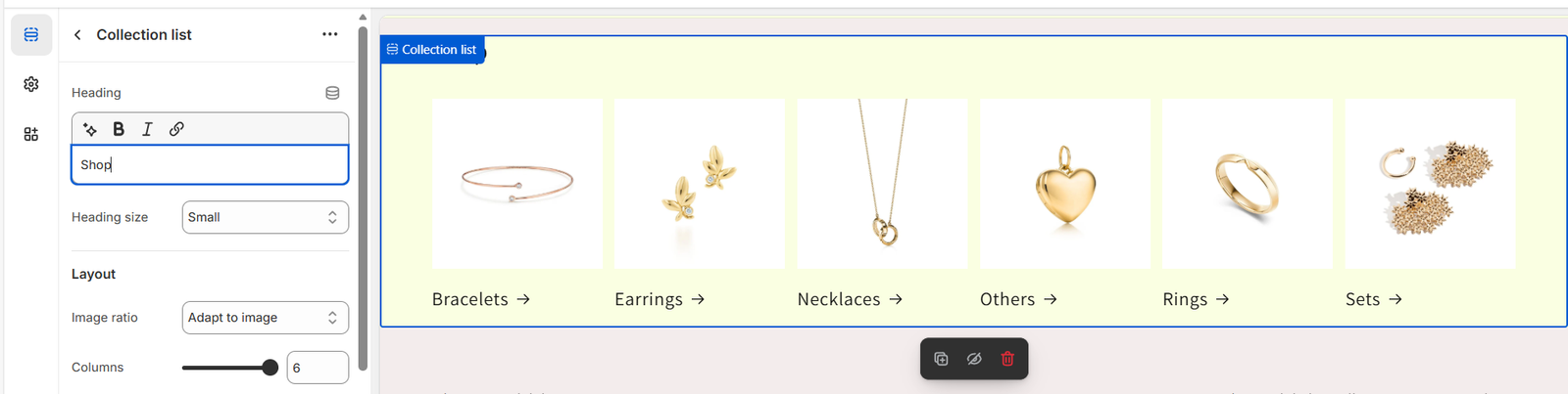
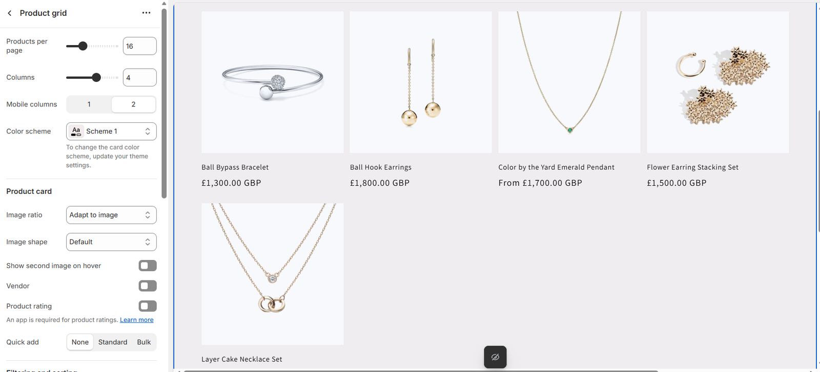
The Shop All template leads with a collection list followed by the product grid to keep merchandising concise and scrollable.
- Collection List: Up to six collections, ideal for highlighting categories or capsules.
- Product Grid: Configure products per page, desktop/mobile columns, vendor display, hover images, ratings, and Quick Add behaviour (None, Standard, Bulk).
- Filters & Sorting: Built-in dropdowns for availability, price, and alphabetical sorting.
Blog Highlights
Use the blog listing to educate customers about lab-grown diamonds, styling tips, and brand values—all surfaced through the Blog Posts section or dedicated blog page.
- Content managed under
Online Store > Blog posts. - Adjust post count, grid columns, excerpt length, and metadata toggles per layout.
- Pair educational series with product CTA buttons for deeper engagement.
Contact Page
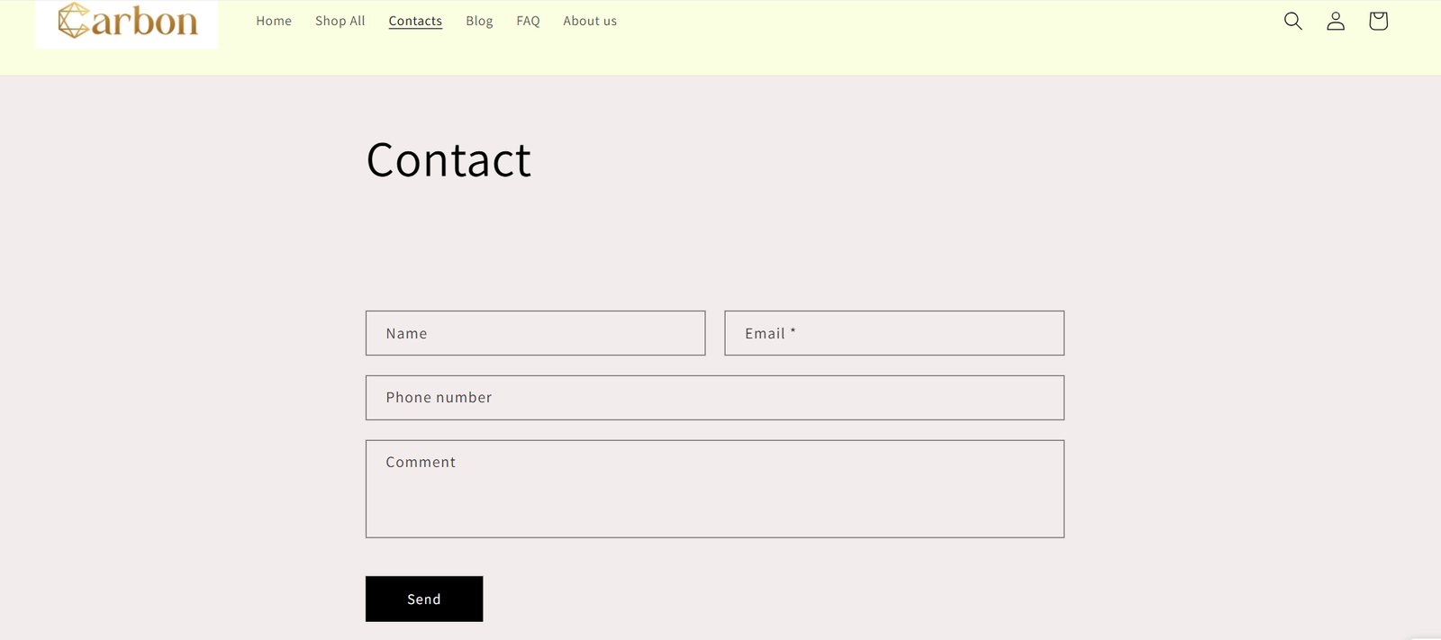
The contact template combines standard Shopify form fields with neutral styling that aligns with the rest of the theme.
- Editable heading, colour scheme, and section padding.
-
Supports custom CSS snippets for typography tweaks (e.g., increasing
h2size to 32 px). - Default form fields: Name, Email, Phone Number, Comment, plus configurable submit button label.
About Us Page
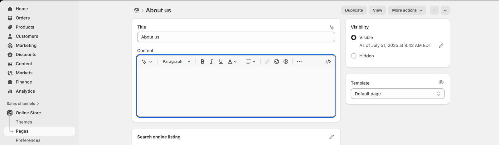
Craft a mission-led narrative describing Carbon Jewellery’s dedication to ethical sourcing and modern design.
-
Utilises the
Pagesection with rich text for mission statements and value pillars. - Supports bold headings, numbered lists, and targeted custom CSS in the section editor.
- Reinforce messaging with imagery or embed additional sections (testimonials, timelines) as needed.
Header & Navigation
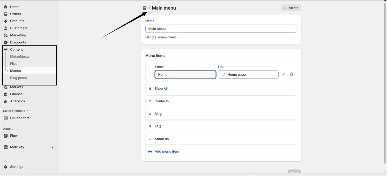
Keep global navigation lean so customers can jump directly into key discovery paths.
-
Maintain menus under
Content > Main menu; match link order to Home, Shop All, Contacts, Blog, FAQ, About Us. - Toggle search, account, and cart icons depending on store requirements.
- Upload desktop and mobile logo variants to ensure clarity across backgrounds.
Footer
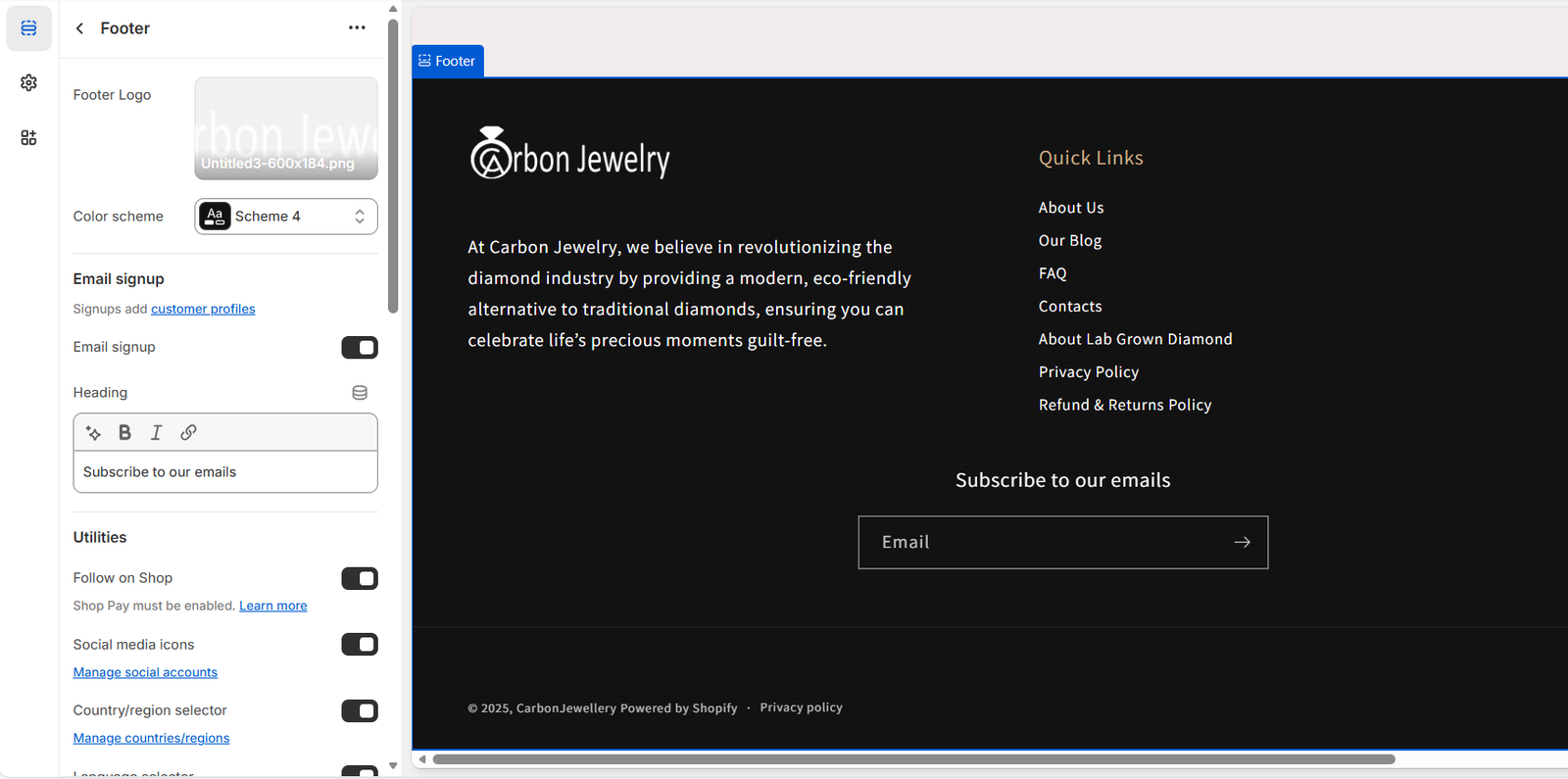
The footer anchors trust and navigation with a dark theme that contrasts the lighter content areas.
- Upload the footer logo and select the dark colour scheme for optimal readability.
- Populate Quick Links with policy pages, diamond education, FAQs, and customer service portals.
- Enable newsletter subscription to capture emails directly into customer profiles.
- Optionally add social icons and region/currency selectors for international shoppers.
Theme Settings
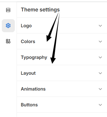
Global settings keep typography, colour, and button treatments consistent across every template.
-
Colours: Adjust palette values under
Theme settings > Colorsto control the schemes referenced by each section. - Typography: Pair refined serif/sans-serif combinations for headings and body copy.
- Buttons: Configure default button shape, border, and hover states to align with your call-to-action strategy.
-
Custom CSS: Apply store-wide tweaks in
Theme settings > Custom CSSor use section-level overrides for scoped adjustments.
Tips for Extending the Theme
- Duplicate the home template to create seasonal or campaign-specific landing pages with alternate hero and gemstone sections.
- Connect metafields to feed extra product data into landing blocks or product cards for richer content.
- Sync the Shape of Gemstone section with collection filters to guide shoppers to preferred cuts quickly.
- Rotate slideshow and banner imagery ahead of marketing pushes to spotlight new collections or promotions.